Get the most out of your display ad campaigns
Putting together eye-catching, engaging artwork will help you maximise the effectiveness of your online campaigns. Here are our five top tips for getting the most out of your display ads.
1. The right artwork for the right device
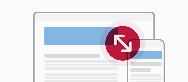
As an increasing number of people use their tablets and smartphones as the default way to access online content, to have the greatest reach it’s important to ensure that artwork for your ad is supplied in the correct dimensions for each device type so that it is displayed correctly regardless of how the website is accessed. For details of the specifications for each slot see the ad guidelines. If you have any queries regarding this, speak to your sales or production team contact who will be happy to advise.
2. Keep it simple
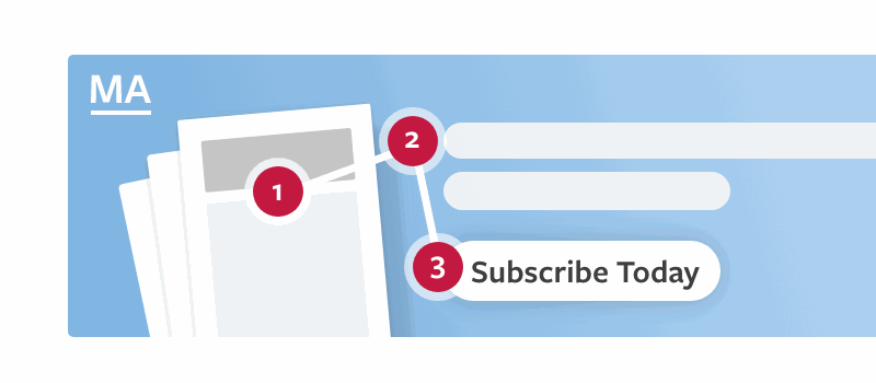
While it’s tempting to try to cram in as much information as possible to make the most of your slot, less is often more. Your ad will be more effective if visitors can see instantly what your company offers and gauge whether or not this is of interest to them. This is even more crucial when designing the smaller banner sizes used as alternatives to leaderboards on mobile. The same amount of information you have on the leaderboard will not fit on a mobile banner. Decide what the key elements are and keep it eye-catching, easy to read and uncluttered. Put yourself in the position of user – why should they click on your ad? What are you offering that your competition isn’t?
3. Branding
Keeping your brand front and centre seems obvious but can be overlooked when advertisers are creating an animated campaign. Bear in mind you have a short amount of time to grab the attention of visitors, don’t wait until three seconds in or more until they see the name of your company, they may have already have moved on. File sizes for animated gifs and html should also be kept as low as possible (between 150kb-300kb max) to optimise load times and, in turn, help your CTR percentage.

4. Fonts
Clear and simple wins the day here. Fonts should be easily legible by ensuring text is not too small, word and letter spacing is comfortable and it is of a good colour contrast ratio (see next point). If you have an established online presence it can be a good idea to use the fonts already associated with your brand to ensure consistency.
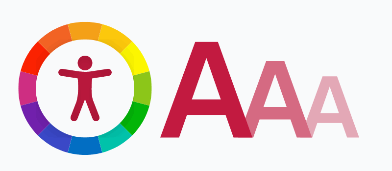
5. Colour choice/accessibility
Think carefully about the colours you choose to use on your artwork. Do they tie in with your brand? Do they convey the right message? Also, when using a combination of colours for background and text, will they be able to be read by someone who has a visual impairment? An easy way to check this is to run the background colour value and the text colour value (hex values) through an accessibility tool such as Colorable. If you’re not sure what the hex values are you can find out via a free browser extension such as Colorzilla.